Colivease
UI Design for a Shared Living Platform
UI design exploration for a youth-focused co-living platform built around clean layouts and playful 3D visual systems.
Visual Direction
Building a Visual Language Around 3D Illustration
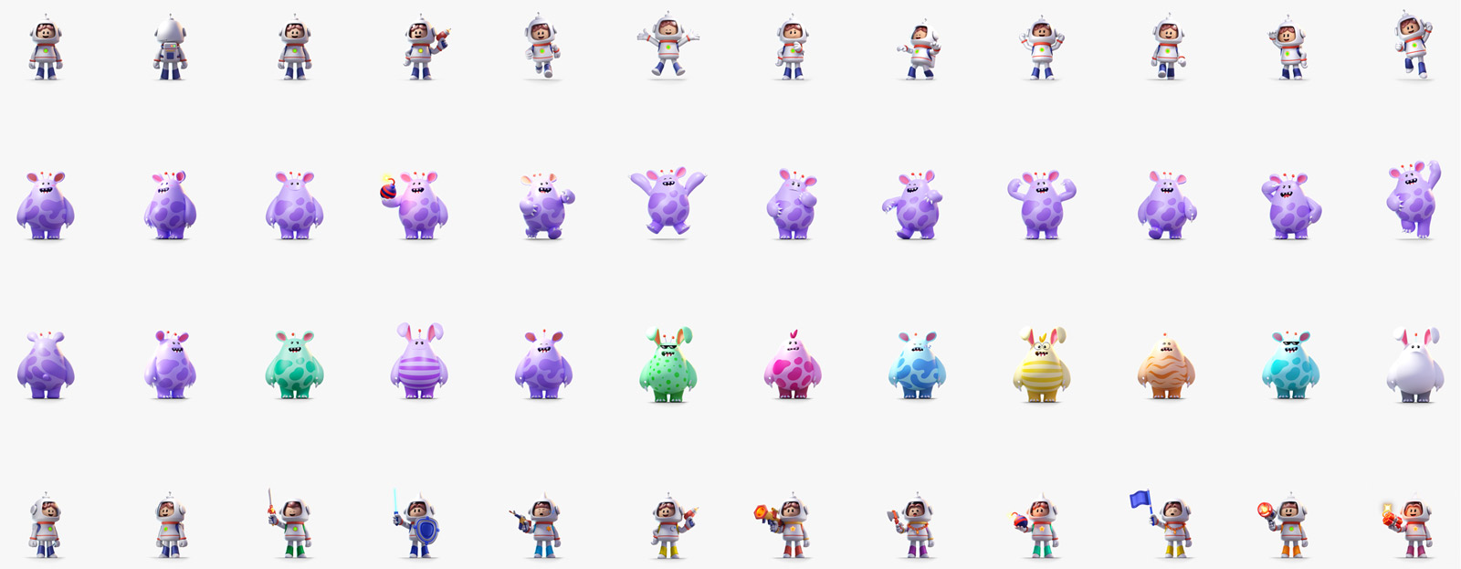
The project began with an existing set of 3D illustrations provided by the client. The challenge was to translate these assets into a cohesive interface system while maintaining a clean layout structure and a more youthful visual tone.
The visual direction focused on balancing personality and usability through simplified layouts, soft color usage, and consistent spacing systems.
Audience & Tone
Designing for a Younger Audience
As a platform targeting younger users and shared living communities, the interface prioritized approachability, clarity, and ease of navigation.
UI components were designed to feel lightweight and accessible while supporting a more friendly and community-oriented product experience.
UI System
Creating Consistency Across the Interface System
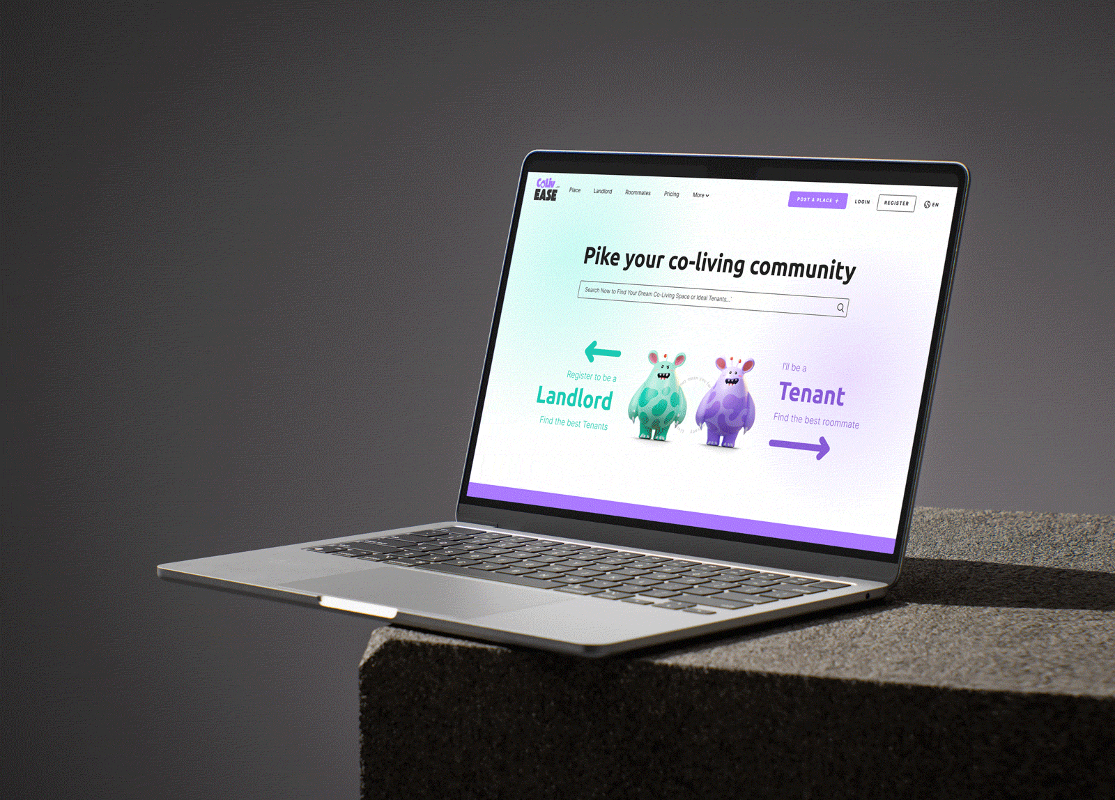
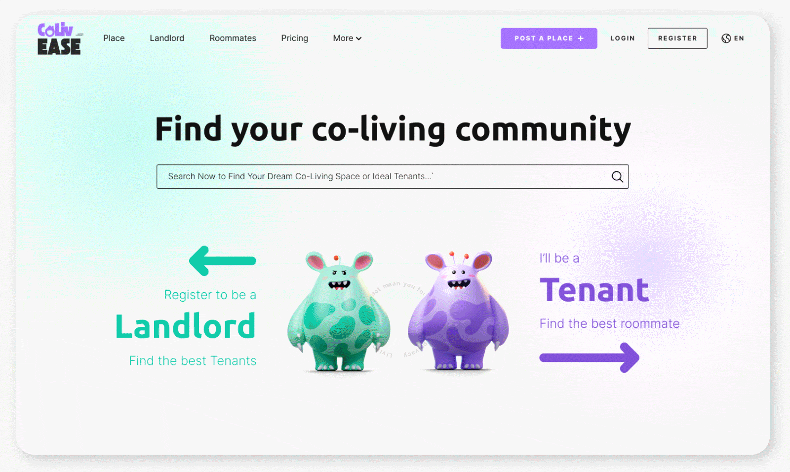
A consistent UI system was developed to unify typography, color usage, spacing, and interaction patterns across the platform.
Special attention was given to maintaining visual cohesion between the 3D illustrations and the surrounding interface elements to avoid visual imbalance or distraction.
UX Design
Simplifying the User Experience
The interface structure focused on reducing visual clutter and improving content hierarchy through clearer navigation, modular layouts, and simplified interaction flows.
The overall experience aimed to feel intuitive and visually engaging without overwhelming users with unnecessary complexity.
Outcome
The project established a cohesive and youthful visual interface system that balanced playful brand elements with clean and accessible user experience principles.
More Work