Kuiper Grow

Brand Identity & Product Communication
End-to-end branding and product design for a full-spectrum grow light startup, spanning identity, packaging, web, and technical documentation.
Brand Identity
Building a Distinct Product Identity
A complete brand identity was developed from the ground up, including logo design, product visuals, packaging, website, and supporting print materials.
The visual direction centered around simplicity, clarity, and energy. Product designs featured a bold orange accent as a recognizable visual signature, while the logo combined the letter "K" with a leaf-inspired form to reflect growth and sustainability through a minimal and modern approach.
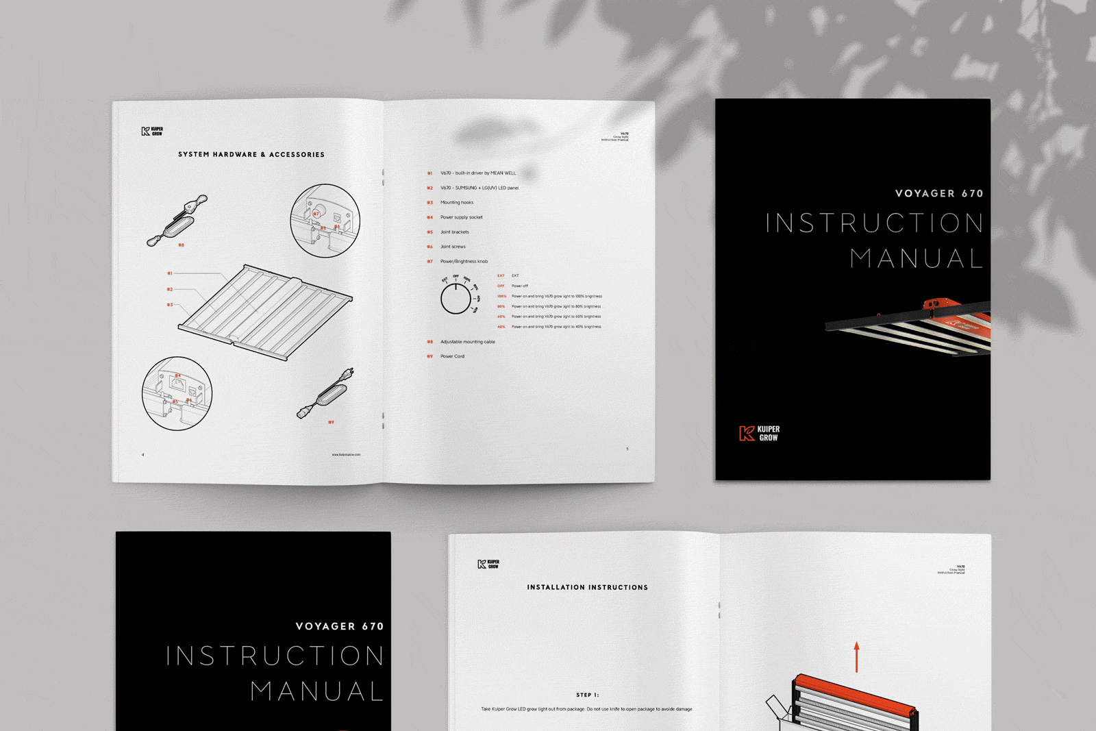
Technical Communication
Designing for Technical Product Communication
As a technical hardware product requiring self-installation, the communication system focused heavily on clarity and usability.
Installation manuals were designed using a simplified visual approach inspired by IKEA-style instructional systems. Engineering 3D models were translated into clean line illustrations to support assembly guidance and technical communication for both customers and sales teams.
View Installation Manual →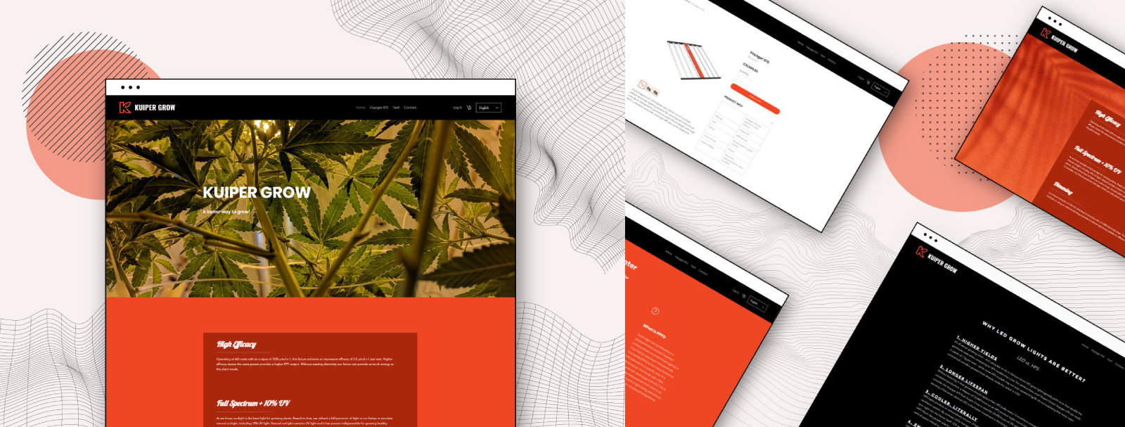
Web Design
Extending the Brand Into Digital Spaces
A fully designed website was created to clearly present product features, specifications, downloadable resources, and installation manuals through a clean and functional interface.
The site focused on simplifying technical information while maintaining consistency with the broader visual identity system.
Visit Website →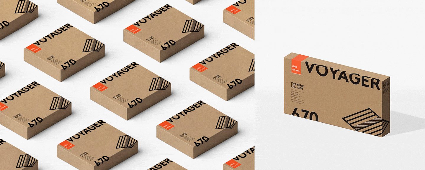
Packaging
Packaging Within Production Constraints
Packaging solutions were developed within a limited startup budget by utilizing single-color printing on existing corrugated boxes. To introduce stronger brand personality and memorability, a bold orange sticker system featuring the phrase "Hello, I'm here!" was created as a more approachable and human-centered interaction point within the unboxing experience.
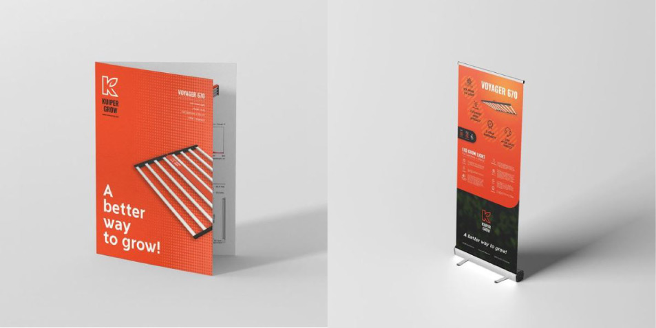
Print Design
Supporting Print & Production Systems
Additional print materials including brochures, specification sheets, and trade show graphics were designed to maintain consistency across customer-facing touchpoints.
Print production, specialty finishes, and sizing coordination were independently managed through direct communication with vendors to ensure accuracy and quality throughout final production.
Outcome
The project established a cohesive and recognizable visual identity for a growing startup brand while translating complex technical products into more approachable and accessible customer experiences across digital, print, and physical touchpoints.
More Work